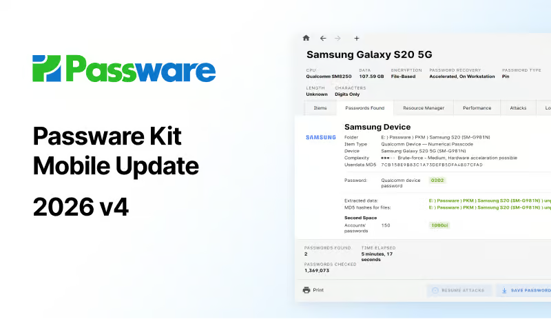
Ryan: Hey everyone. Ryan here from your Oxygen Forensic training team, and in today’s video we’re going to discuss a new feature found in our Oxygen Forensic Maps. As we know, there’s multiple ways to access our Oxygen Forensic Maps from our Oxygen Forensic Detective home screen. At the bottom, under our tool section, we can independently launch our Oxygen Forensic Maps. From here we have the option to download our offline maps if you’re on an air gapped machine. Once past this window, I can import KML/KMZ file, GPX, OCB and even DJI log files. This allows us to independently load in map data for review and examination within our mapping tool.
So let’s do just that. I’m going to go ahead and import a KML or KMZ file. Another way for us to access our Oxygen Forensic Maps is from our cases or our individual devices. From a case level, I can go to my files and simply select my maps icon at the top toolbar. This is going to give me the option to open in a separate window or in the same window as a new layer for my map. So I want to open this in the same window. Depending on the size of data that you’re pulling into the maps is going to determine how long it takes to pull those data points in. As we can see, they’re listed as a brand new layer and a colorized layer at that.
Another interesting way to be able to pull in map data is through your individual timelines, both at the case and at the device level. So if you’d like to plot your geo points in a timeline order perspective, then you could do that here from our timeline section with that same map icon button in our top toolbar.
So let’s go back to our maps and let’s talk about this great new feature. So as we’re familiar with our Oxygen Forensic Maps on the left hand side in our column one, this is going to be a list of all of our layers and all of the subsequent points per layer that are displayed here on the map. Each one of these dot and line icons here, if you select them, is going to display for you all of the points associated with that particular layer and each one of these as an individual layer to be able to click and filter directly to that one individual point.
Down here at the bottom of column one is going to be details about that particular point you’ve chosen or that layer that you’ve chosen to display. All of our same mapping features here are the same down here at the bottom about selecting how you’d like to view the points on your map. We have the option to show places, route lines and common locations, zoom in and out, center in, or show all geo points, so all of our available geo points based off the available layers, here in column one can be displayed in a holistic view. We have our distance measurements, geofencing and filter options, and then down here is where we find our places, routes, and common locations, depending on the types of data you have loaded into this map.
What I want to bring specific attention to here is up here at the top of our maps. Typically we’re used to seeing our timeline filter here where we can adjust our timeline based off of what points you want to see based off the timeframe that those points may fall within. Next to our timeline filter, we now have our activity matrix, and this should be very familiar based off of our calls and messages section from within a device within Detective. This is going to offer us the same options in order to directly filter into heightened points of activity based off the geolocations plotted on the map.
So just like we would see with our calls and messages, we have the ability to filter down specifically into each one of these items. So if I wanted to look as to why 3.6K points at 8:00 AM on Wednesday is important, I can double click and it’s going to filter for me on my map what those locations look like based off this one individual filter.
So it’s sort of like a heat map for our mapping tool gives you the ability to take a holistic look at where our heightened levels of activity are. Just like we had seen in Detective and in that call and messaging section, we have the ability to individualize our activity level settings. So this is going to give us the ability as the investigator to adjust our thresholds based off our investigative needs or how we’re interpreting what may constitute low, medium, high, or extreme levels of activities within the displayed data points on your map.
These simply just slide left and right again based off of what that activity is going to look like for you and within your organization. And once I select, “okay”, once my thresholds have been adjusted, then we see that reflected here in our activity matrix again. Aside from being able to simply double click on individual points, we can reset those filters if we want to see all of our points displayed again.
However, if there’s a specific timeframe that you want to look at, for instance, between 8:00 AM and 11:00 AM Monday through Friday, I can simply select my time here at the top of my activity matrix, press my control key on my keyboard and continue to highlight all of that data and then apply that filter and then that data is then displayed on my map.
So I could really get specific here as to how I’d like my data displayed for me. On top of how this data is displayed, those same features to be able to create snapshots of this map for inclusion in any reporting for your case, you can do that as well with those same options under our export menu and save a snapshot, or export the entire map as an image.
We can filter down by all of our extreme activity, our high activity, moderate or low activity levels as well over here in our activity matrix legend. I can double click on each one of these levels and it’s going to automatically apply for me the filter that I’m choosing to apply. So a lot of opportunity here within our Oxygen Forensic Maps now through our new activity matrix inclusion, to allow you to really drill down into the amount of data that you have displayed on a map to really show specifically what you want displayed on the map for further examination and analysis.